Deep Blue & Amber Gold with standard rounded corners and glass elevation.
TCclngzesssnz0bs Template Design System Showcase
Interactive catalog of reusable components, Material 3 color roles, and theme presets for all parked submodules.
Card Containers & Surface Fills
Sample container cards with generic paragraph text, badges, and layout surfaces under the active theme geometry.
Generic body copy inside a standard surface container card. Adapts corner radius and border styling automatically.
Generic text inside an elevated container card with subtle background tinting for secondary blocks.
Generic text inside a primary tinted container card for high contrast callouts and notice boxes.
Generic text inside a secondary tinted container card for accent highlights and features.
Generic text inside an outlined container card with reinforced border lines and clean surface fill.
M3 Palette & Semantic Tokens
All components consume these standardized CSS tokens to guarantee contrast and visual harmony across dark and light modes.
Primary
--md-sys-color-primaryMain brand color for primary actions & prominent headers
bg-primarySecondary
--md-sys-color-secondaryAccent highlights, callouts & secondary buttons
bg-secondaryTertiary / Accent
--md-sys-color-tertiaryContrasting accent color for tags, badges & special flares
bg-accentPrimary Container
--md-sys-color-primary-containerTonal background for secondary cards & featured blocks
bg-primary/15Secondary Container
--md-sys-color-secondary-containerTonal container background for secondary elements
bg-secondary/15Surface / Base 100
--md-sys-color-surfacePrimary page background and clean card surfaces
bg-base-100Surface Variant / Base 200
--md-sys-color-surface-variantSubtle section backgrounds & muted container fills
bg-base-200Outline / Border
--md-sys-color-outlineDividers, card borders & form input boundaries
bg-base-300Error
--md-sys-color-errorValidation errors, alert banners & destructive actions
bg-errorPage Headers & Banners
Page header banners rendered uncontainerized full-width as they appear on live pages.

Photo Hero Header
Photo-canvas background hero with dark gradient overlay for high contrast photography headers.
Article, Feature & List Cards
Prop-driven reusable card elements for articles, pillar lists, and feature grids.
Generic Article Container
Sample text content inside a standard card container displaying paragraph copy and category tags.
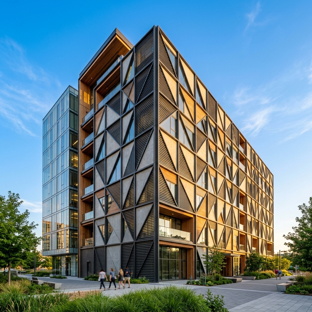
Top 2/5 Cover Image Article Card
Featured article card featuring a 2/5 top cover image, category badge overlay, summary snippet, and Read More action button.
Soft Feature Card
Tinted icon container with subtle border for pillars, features, and core values.
Elevated Feature Card
White/surface card with top primary border line and lift-on-hover effect.
ListCard Component
- Bullet point item 1 with clean checkmark styling
- Bullet point item 2 with automated spacing
- Bullet point item 3 for lists and service scope summaries
Responsive Image Gallery Grid (4 per Row)
Tags, Badges & Notification Banners
Standard alert banners and badges for status indicators, categories, and form responses.
Badge.svelte Variants
Usage: <Badge variant="primary">Label</Badge>
Alert.svelte Variants
Success!
Your submission has been received.
Error!
There was a problem processing your request.
Photo Canvas, Pattern Tiles & Decorative Flares
5 distinct geometric tile patterns for Hero banners, photo canvas wrappers, and ambient flares.
Background Patterns & Fills (PatternTile.svelte)
Moroccan Star Zellige
Bauhaus Architectural Grid
Organic Wave Arcs
Cyber Hex Mesh & Nodes
Memphis Terrazzo Shapes
Solid Gradient (2-Color Fill)
Solid Clean (1 Single Brand Color)
Responsive picture wrapper with rounded canvas border.
Radial Flare Background
Radial gradient overlay positioned in corners to create subtle depth behind heroes and CTAs.
Headings, Paragraphs & Buttons
Base typographic hierarchy, Accent Title variants, and standard action buttons.
Heading 1 (Title Font)
Heading 2 (Title Font)
Heading 3 (Title Font)
Accent Title (Gradient Underline)
Standard body text using var(--font-sans). High legibility and optimized line height for
long-form reading across device screens.